Cases
Design the ultimate street ad
You have a creative idea. You have a media plan. And you've made the right choice: Out of Home (OOH) and/or Digital Out of Home (DOOH) are in your strategy. Now it's time to bring those powerfully to life. But how do you design the ultimate OOH or DOOH ad?
We get these questions time and again from brands, creatives and designers who don't often work with Out of Home campaigns. Our most important advice? Understand what each part of your OOH campaign needs to do and stay focused on that goal. Your goals may vary. Be it brand awareness, product consideration or a specific campaign phase.
Ready to make an impact? Let's get started!
A powerful framework for impactful posters
We have developed a framework that supports designers in creating visually powerful posters. This model helps to get your message across clearly, convincingly and creatively.
We summarise our framework in four key words:
- Simple
- Striking
- Powerful
- Clear
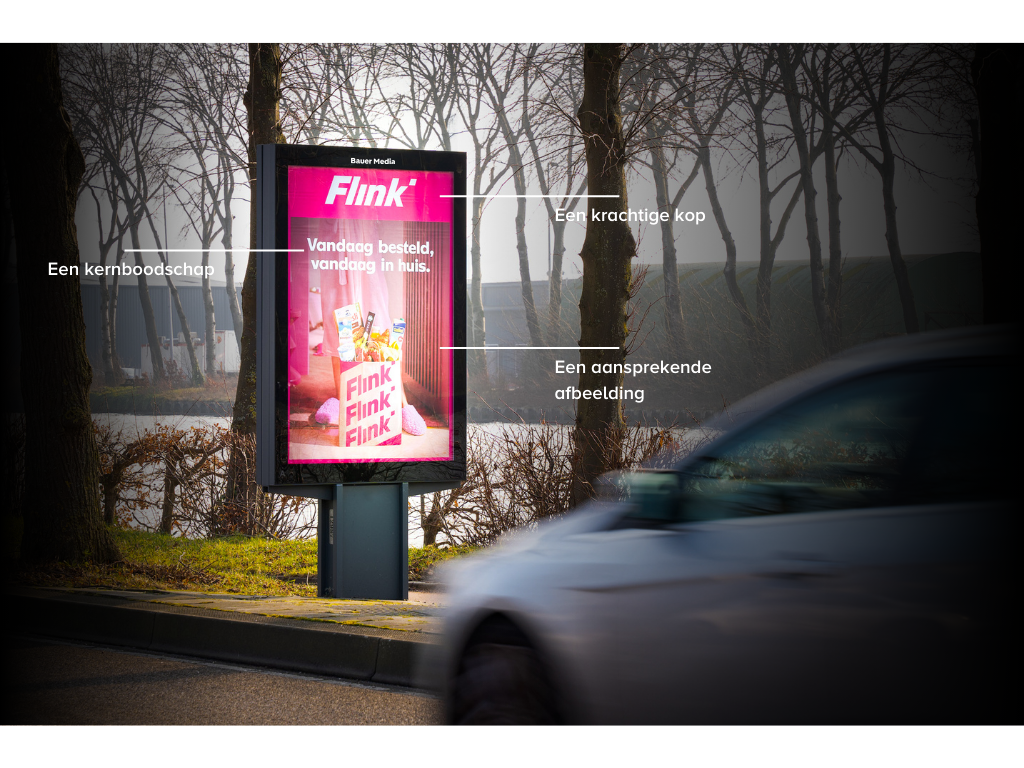
Simple
Simple poster designs are effective.
An effective ad is all about a powerful headline, an appealing image and a clear core message that aligns with your objectives. Talon's Creative Canvas Insight study shows that simple designs attract more attention than busy ads. When a viewer has to put too much effort into understanding the message and call-to-action, the impact decreases. So keep it clear and uncluttered for maximum impact!
Conspicuous
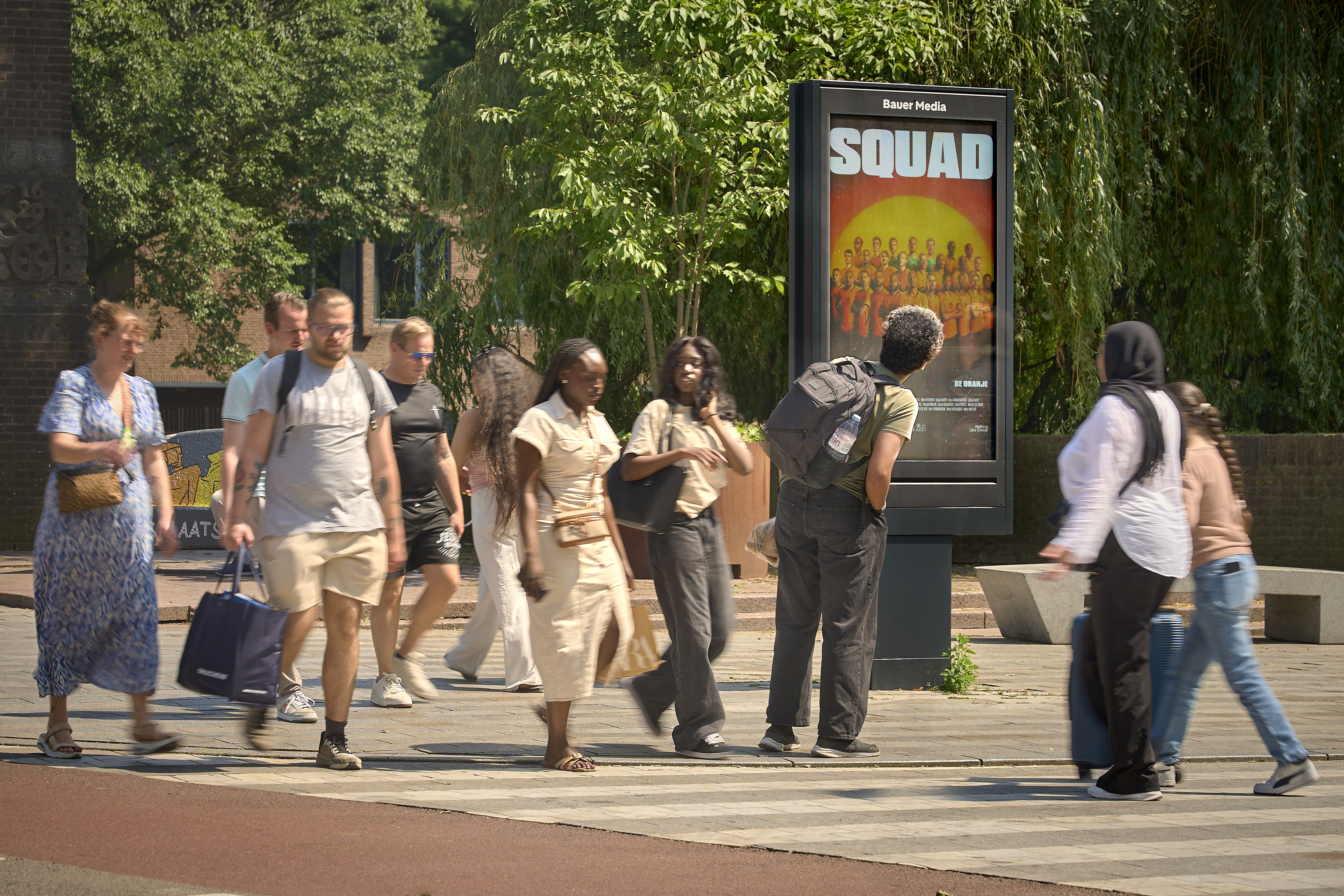
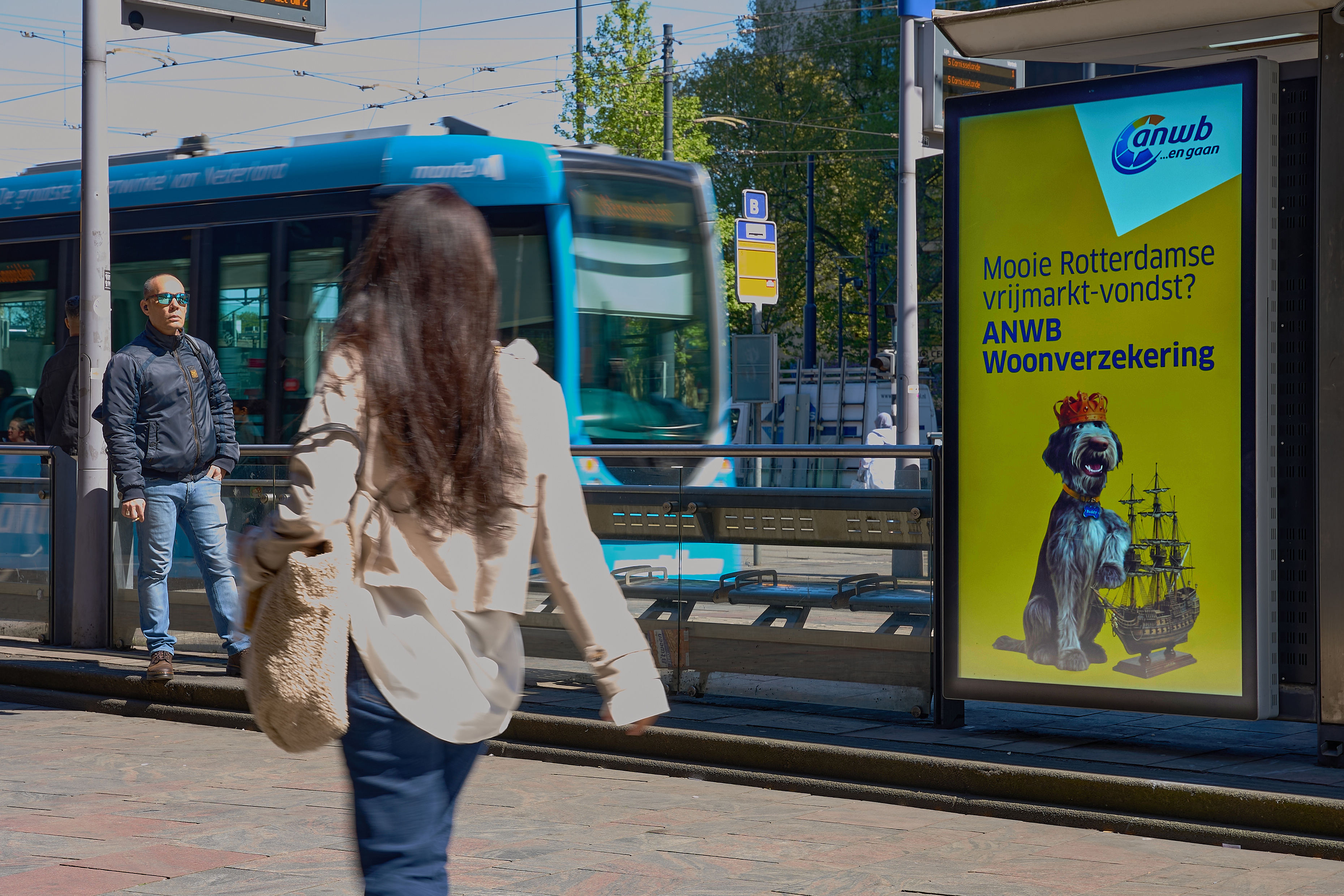
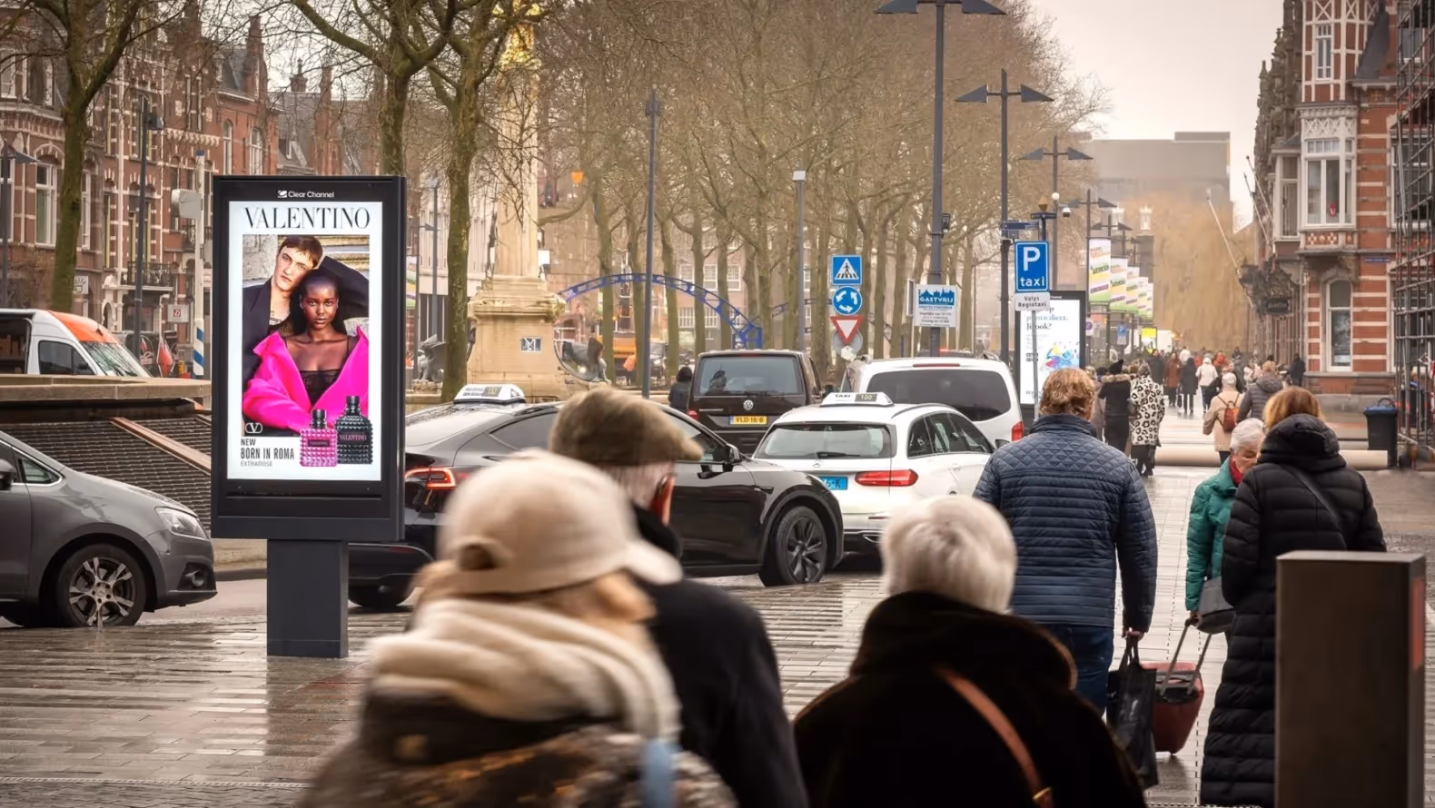
Good Out of Home ads attract attention.
Beautiful imagery, be it high-quality product photos or well-captured lifestyle photography, with plenty of free space for easily adding text and branding are essential for creating Out of Home ads.
To get your message across quickly, especially on roadside formats that are viewed at a high speed and/or from a distance, high-contrast typography and a larger text format offer the best opportunities for people to understand and digest your message. Make the most of the expression, make it clear and visually connect with your brand and campaign.
Besides contrast, bright and vibrant colours also work well in Out of Home.
Powerful
Closely linked to simplicity is keeping your message short and powerful.
Several industry studies have shown that shorter, concise texts make for better understanding and recall. Posterscope's Creative Elements for Effective Campaigns study shows that optimising headline length and logo size are the biggest creative drivers for increasing brand impact and recall, and a KantarMillwardBrown study shows that more concise communication has a greater impact on recall and understanding.
2.4x increase in message recall
Source: Powerful posters, Bauer Media Outdoor and Gorilla in the Room, 2022
Clear
The composition of your poster should ensure that it can be easily scanned, recognised and understood.
Expressions are read from left to right and top to bottom. Each element of your poster should add something to, rather than detract from, your objectives. Composition and a clear layout create an easy flow, making it easy for passers-by to absorb your message.
For younger brands or brands looking to build a healthy image, insights show that enlarging your logo for association is a sensible way to achieve this. Attract (1) with an important image, communicate (2) your message with a clear headline and associate (3) with your brand well incorporated in the ad. Making your brand more prominent at the beginning of the stream will also help with recognition.
Building on striking and powerful, an important part of creating a readable, effective poster is to make sure your text is big enough to read. And is it big enough to be understood? On a poster or digital roadside screen from a car?
Cases